InPrint Magazine is a student-run magazine at UC Davis focusing on socio-political topics in annual publications.
The theme of Issue 6, Revival, centers around recognizing sociopolitical events and topics and reflecting on ways we as a society can overcome them.
As a member of the graphics team, I collaborated with a writer to design a layout for their article, The Re-emergence of the In-Person Classroom, which discusses the disadvantages of virtual learning and the advantages of returning back to classrooms.
As the end product, my layout design was part of the printed publication of the magazine and sold to the local community.
Project Team Tools Timeline
Typography Andre Lam Illustrator Five months
Layout Design Frances Bustillo InDesign Nov 2021 - March 2022
Illustration (writer) Pen and paper
Research and Planning
Moodboard
I first consulted with the writer, who requested a clear juxtaposition between online learning and in-person classrooms. After reading through the article and doing some of my own research, I created a mood board for inspirational imagery and graphic style.
Sketching
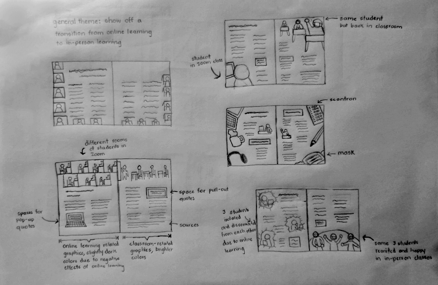
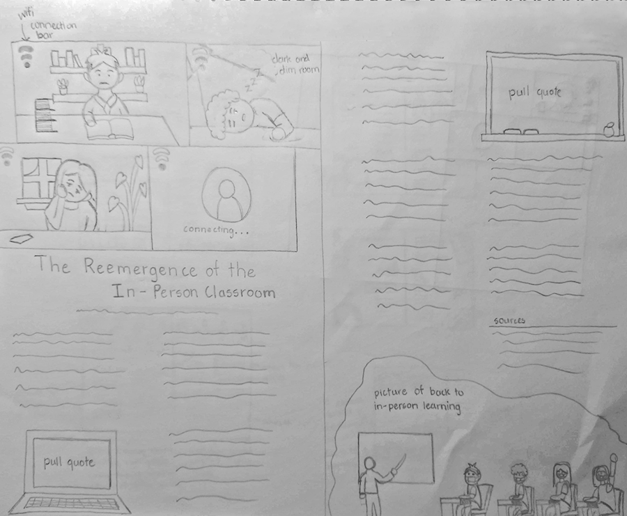
As I sketched out ideas, I focused using imagery as a visual complement to the written content and explore pull-out quotes to highlight key points of the article.
I was visually drawn to the sketch with the online Zoom call and physical classroom. After getting some feedback from peers, I refined the sketch to get a better visual representation of how the text would be laid out in conjunction with imagery.
Graphic Standard
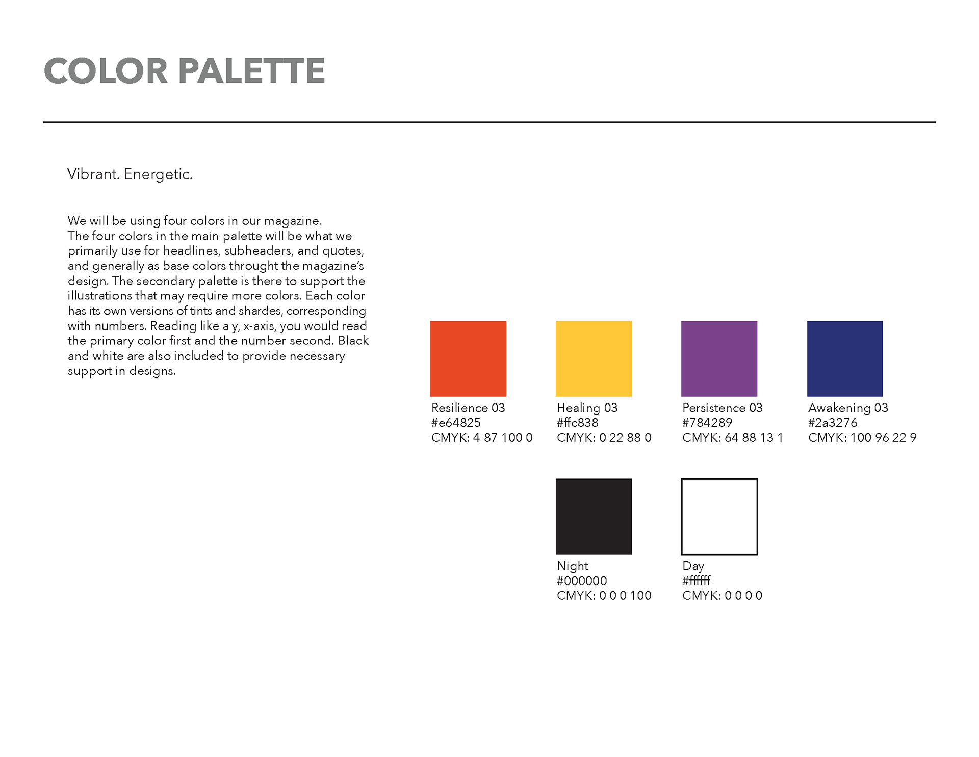
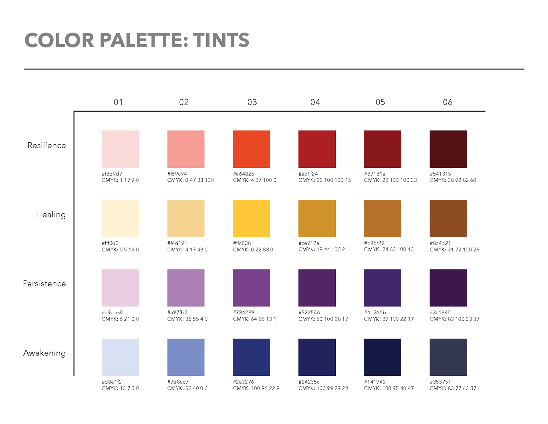
My team lead and art director set these colors to represent the feelings of revival: perseverance and rebirth. I took advantage of the lighter and darker color tints to both control the tone of the article while staying in line with the issue's theme.
Digital Draft
For my first digital draft, I focused on creating the primary illustrations of the layout. My team suggested giving more life to my illustrations, such as diversifying the characters and adding background details.
I also wanted to add more illustrations throughout the text itself to add more user engagement, but wanted to ensure there was enough negative space for reading comfort. I decided to opt towards a four-page layout instead.
Final Version
For the final iteration, I enhanced the main graphic elements (the video conference meeting and the classroom) and added complementary graphics throughout the layout to create a more immersive and compelling narration.
Graphic Elements
Mockups
