Sherpa is a digital platform that fosters deep and personal mentorships between new and experienced professionals.
This was a team project that I worked on with three other designers and a project mentor over the course of six weeks. We developed a high fidelity prototype which we presented to a panel of UX industry professionals from Microsoft, Netflix, and NVIDIA.
My role
I conducted user interviews, synthesized research data, and developed the onboarding and mentor matching quiz features.
Solution Preview
Mentor Matching Quiz
A casual quiz asking questions to match mentees with mentors best suited for their professional and supportive needs.
Community Forum
A safe space for mentees of all levels to ask questions and support each other.
Prompt Generator
Building confidence in new mentees by generating a personalized list of questions to ask their mentors.
Project Overview
Timeline
April - June 2022
Tools
Figma, Notion, Google Forms
Joining the workforce is a major challenge for new professionals jumping into the industry, especially for inexperienced college students.
A mentor can be essential in giving invaluable advice and guidance in helping them transition to their first jobs, but many find networking with more experienced professionals to be quite intimidating. Some feel they don't want to trouble a professional, while others don't know where to reach out.
User Research
Coming into this project, I had limited knowledge in what the mentorship landscape was like. Based on our literature reviews about the benefits of having a mentor and the different types of relationships in mentorships, my team and I crafted a user survey to gain a better general understanding of the motivations, successes, and challenges behind seeking mentorship.
We surveyed 67 people, consisting of mentees, mentors, and students without mentorship experience. From people without mentorship experiences, we learned that:
A large percentage of students lacked confidence and felt they weren't good enough to be guided by a mentor. Existing mentees had similar experiences, but different results according to surveys and interviews:
Mentees enjoyed relationships with open communication and trust where they can share vulnerabilities and grow from them.
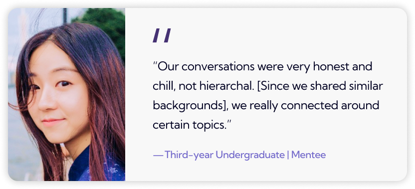
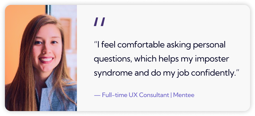
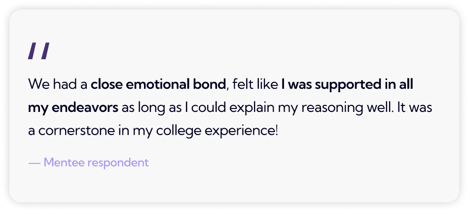
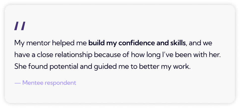
Learning from these mentees' experiences, we wanted to translate their successes to those interested in mentorship but afraid to take the first step. We then crafted a problem statement to set the basis of our project.
Problem Statement
Mentorships are invaluable experiences for professional growth, yet college students lack the confidence to take this important learning opportunity.
How might we...
■ create a platform where approaching mentors for professional advice can feel simple and natural?
■ help mentees develop long-term mentorships as reliable resources for growing their career?
Initial Brainstorming & Ideating
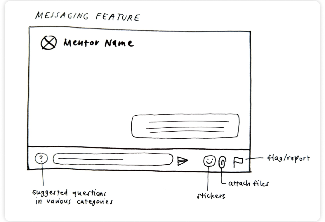
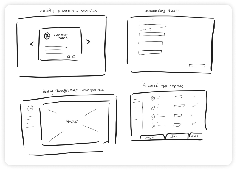
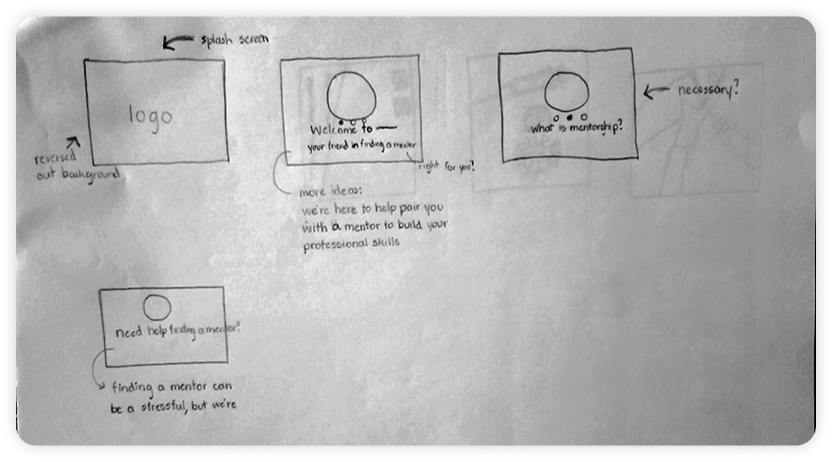
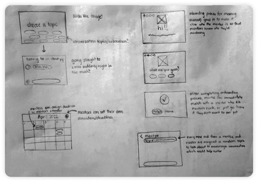
Our team started sketching out different features, such as mentor profiles and appointment scheduling. However, we struggled with the identity of our platform as there were two ambiguities we had trouble addressing.
1. How would we encourage shy college students to forge deep and natural connections with their mentors?
2. How would we differentiate our platform from other competitors?
Competitive Analysis
To shift gears, we took a more in-depth look at other existing platforms, such as ADPList, MentorCloud, and MentorCruise, to analyze what successes and drawbacks they had.
Websites feel emotionally distant
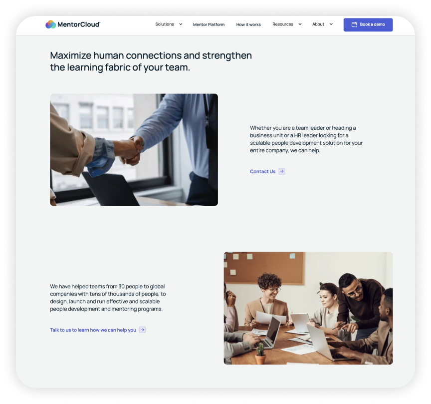
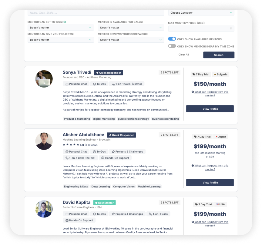
A lot of sections involved heavy text, dull color schemes, and generic stock images, which doesn't seem engaging for a place to connect with other people. Even MentorCruise's mentor browsing resembles more of a marketplace that implies mentors as items to buy.
Mentees lack the tools to express themselves personally
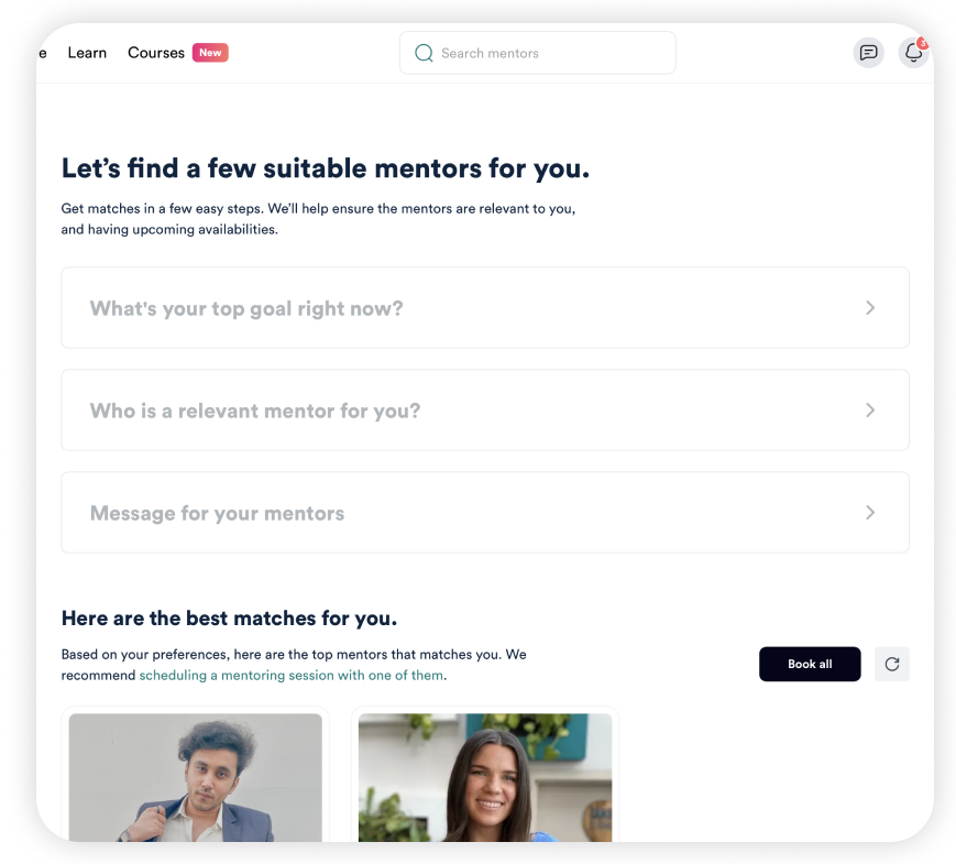
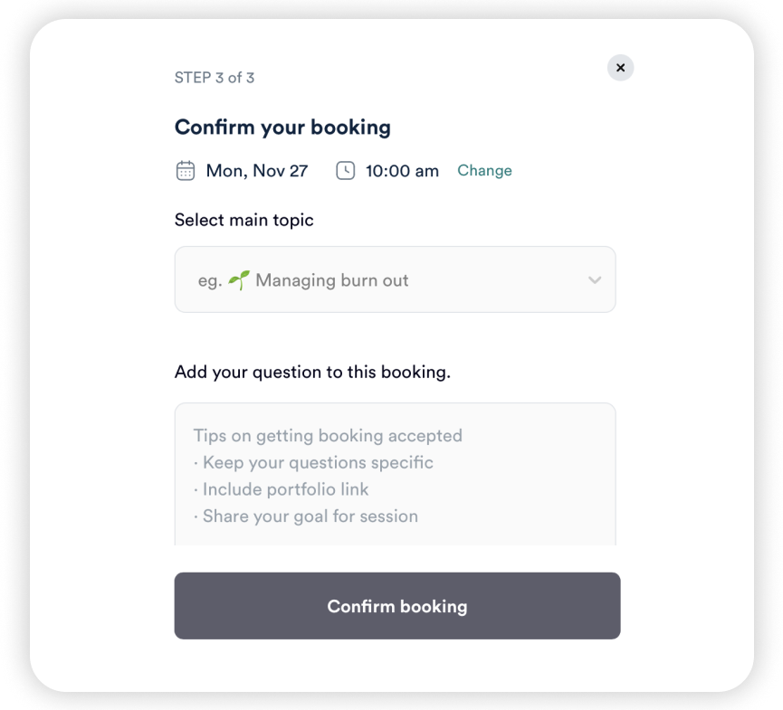
When mentees apply for mentors, they're often asked professional questions (i.e. what career are you interested in, what are your goals with mentorship), but not personal questions. Going back to our research showed that the best mentorships thrived on a personal connection, which meant learning about each other outside of their professional lives.
Reassessing Our Ideation
Taking what we learned from competitor websites, we decided to focus on the emotional design of our platform putting more effort into humanizing the experience as a way to make mentorships' professionalism feel less intimidating and more inclusive.
Onboarding + Mentor Matching Quiz (my feature!)
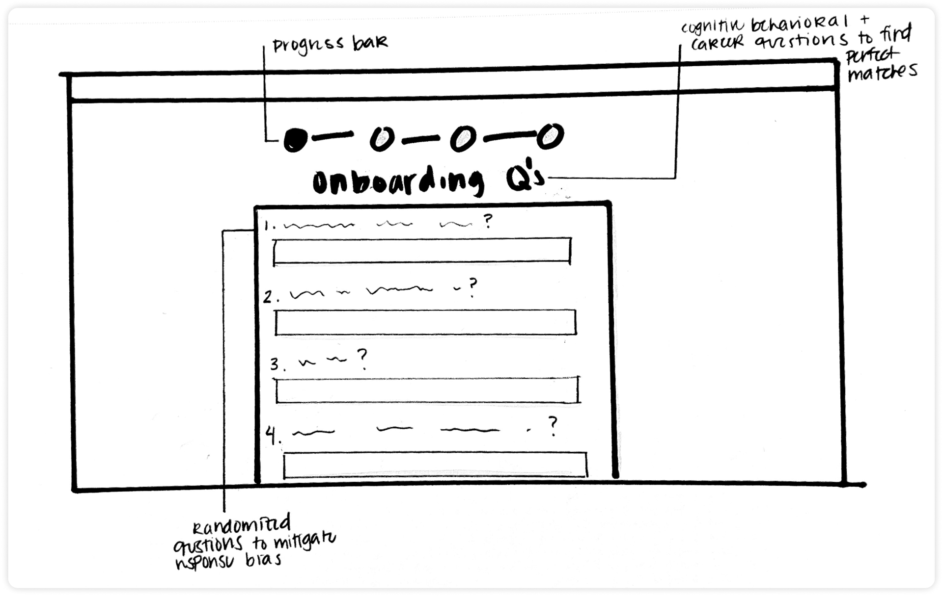
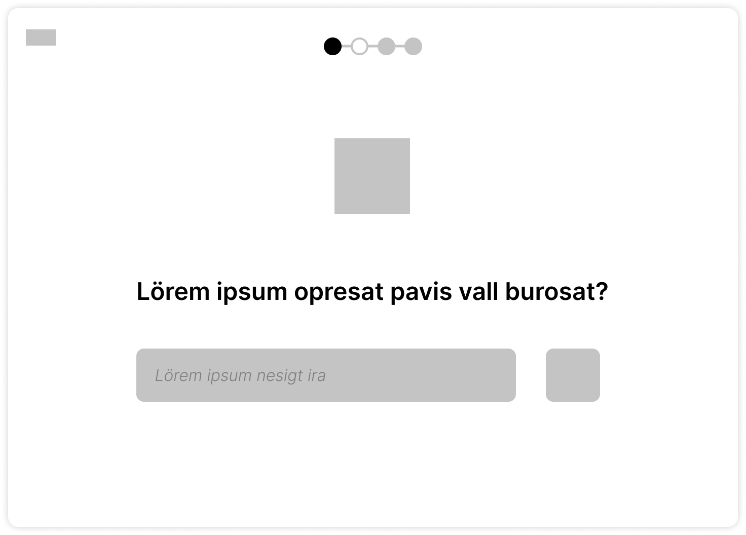

Inspiration
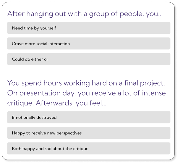
Surveying mentees' emotional, cognitive, and behavioral approaches to social interactions to match up with mentors that suits their personality and goals.
As we envisioned our platform to highlight mentorships as safe spaces to learn, users' first impressions of the platform needed to reflect that idea through the onboarding process. I took inspiration from the lightheartedness of online personality tests (see bottom row of images above) as I designed the onboarding process as the foundation of user trust for our platform.
Mentor Profiles
Allowing a mentor's more personal side shine through alongside their professional background, letting users to feel more comfortable reaching out and encouraging deeper connections.
Mentee Dashboard
The hub of a mentee's mentorship experience, users can access resources to better prepare themselves for mentor meetings such as a prompt generator and community forum.
Mid Fidelity
We translated our ideas into mid fidelities on Figma as we wanted our concept to be ready for user testing while implementing more of our concepts. I also had the chance to further implement features for the onboarding process.
Usability Testing
To test the feasibility of our features, our team developed a list of tasks to complete and had college students follow them in our prototype.
We received positive feedback about the supportive and inviting tone of our platform, so we knew we were headed towards the right direction. However, there was room for improvement, especially for the onboarding experience:
Concerns of privacy and confusion behind purpose
Users were confused about how answering these questions were relevant to the mentor matching process. Additionally, many were hesitant in answering the questions as they didn't know who would be able to see them.
"I have to go through all of this?"
Users voiced that the process felt too long going from the beginning of the quiz to finally matching with a mentor, which could be a barrier of entry for new users.
Design System
Before we applied our test findings, we realized that our individual pages had inconsistent header styles, colors, and other visual elements. To make our a platform a consistent and refined experience for our users, we established a design system as a central guideline for our individual works.
Applying User Feedback
Our team continued to refine our features, as well as gradually incorporating our design system.
As for the onboarding experience, I overhauled the design to be more legible while also making changes according from what users said during our usability tests:
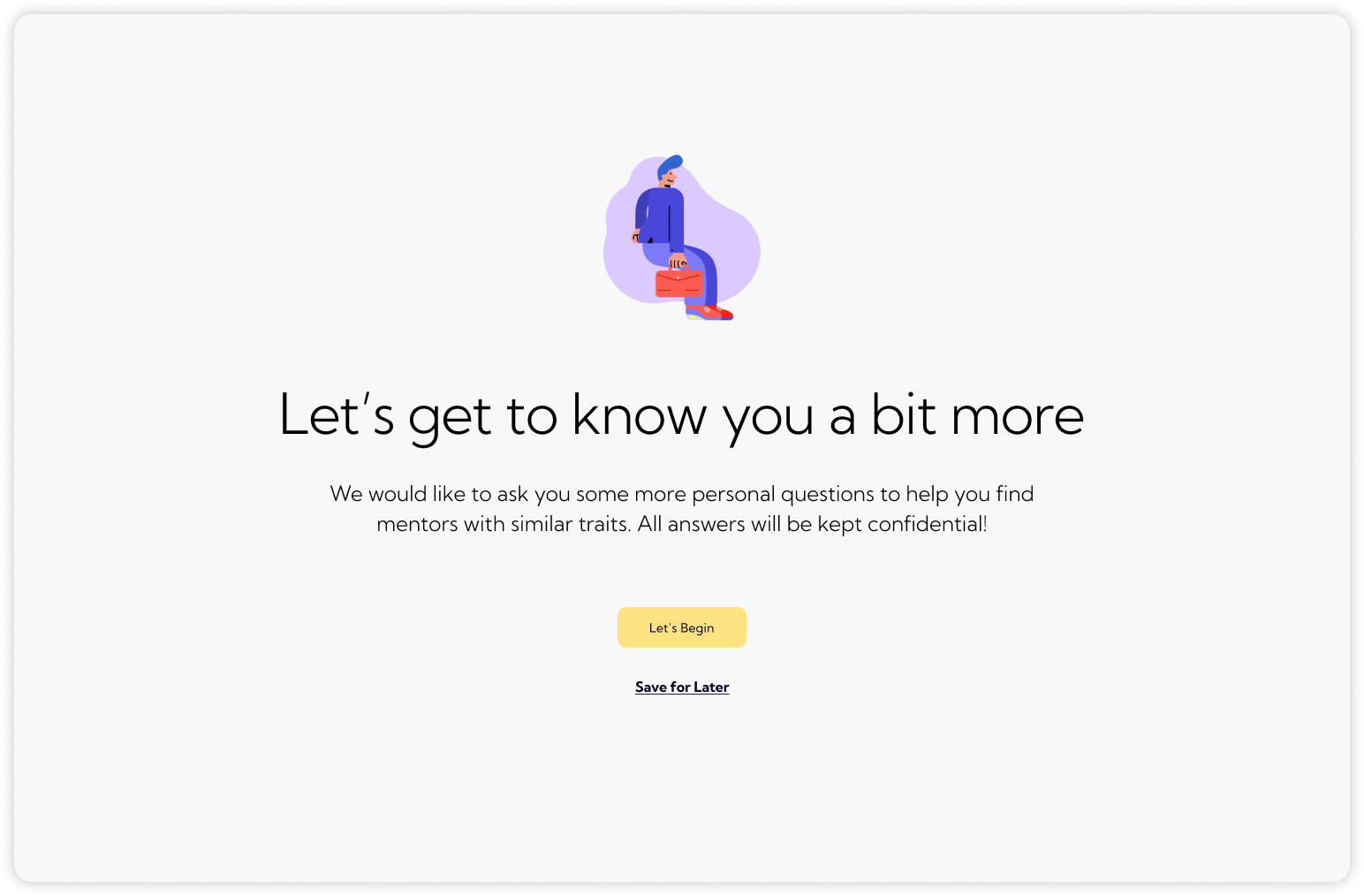
Splitting onboarding into two sections
I moved the demographics question to be its own section to clarify which answers would be public and private, while allowing accessibility to skip/return to the quiz at another time.
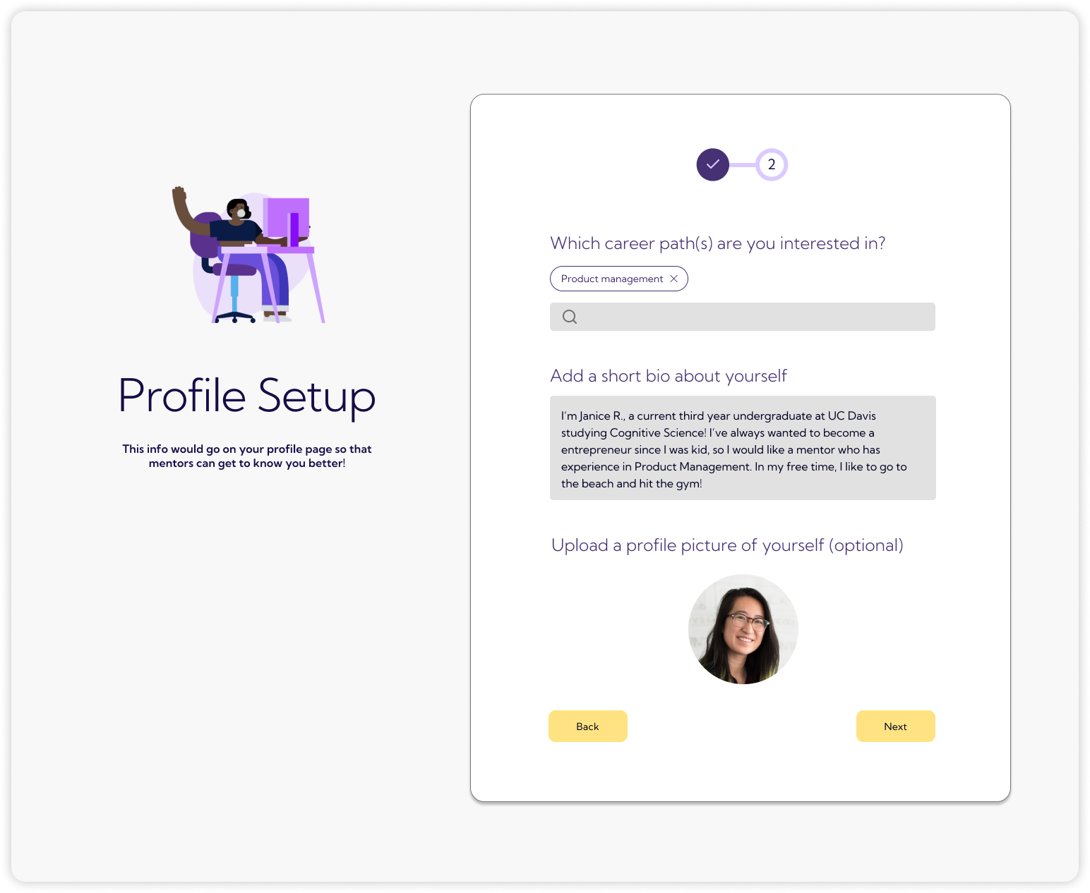
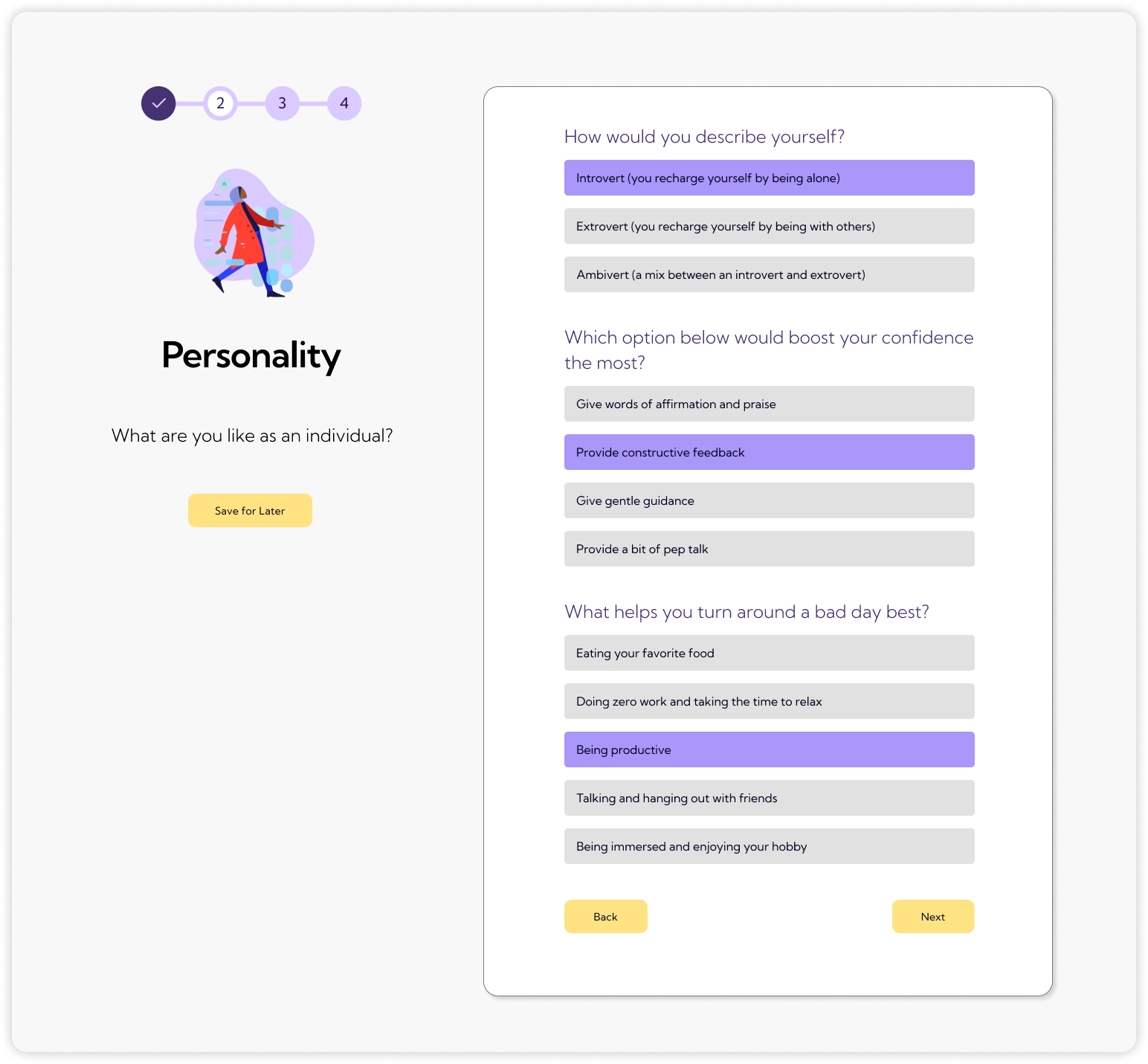
Reducing the amount of scrolling per page
Nothing feels worse than opening a survey and having to scroll for eternity to reach the end, so I aimed to fit all of the page content into one screen to minimize the need to scroll.
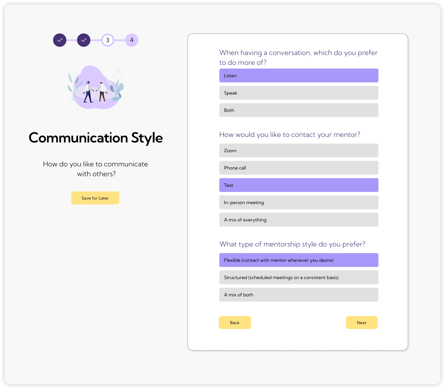
Adding comfort to the experience
I adjusted the descriptions to be more transparent, made questions more casual and relatable to answer, and added save buttons for accessibility.
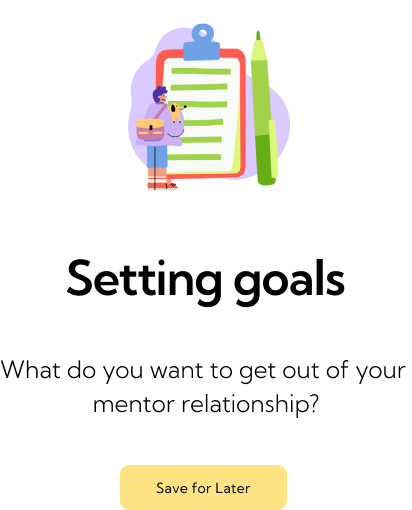
Final Prototype
Onboarding / Mentor Matching Quiz
Mentor Browsing
Mentor Profiles
Community Forum
Mentee Dashboard / Prompt Generator
Presentation Day
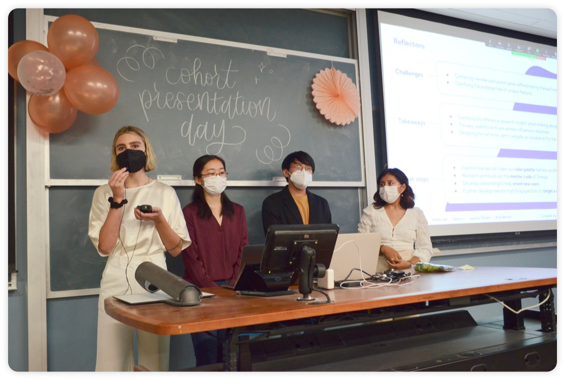
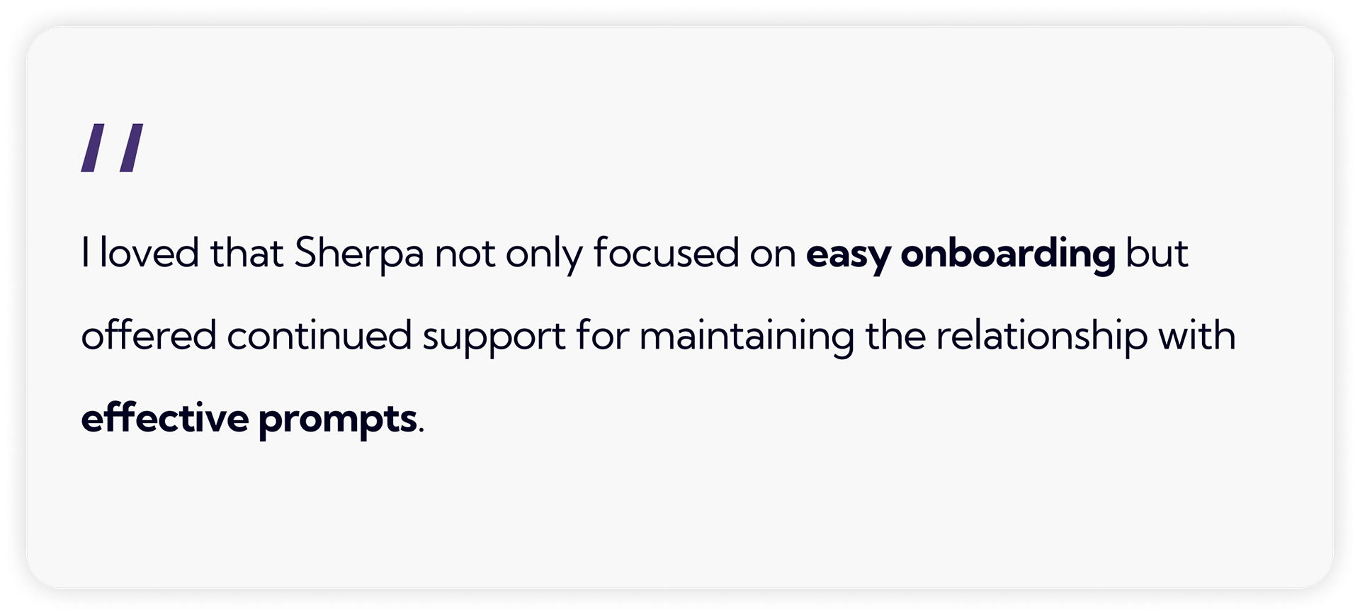
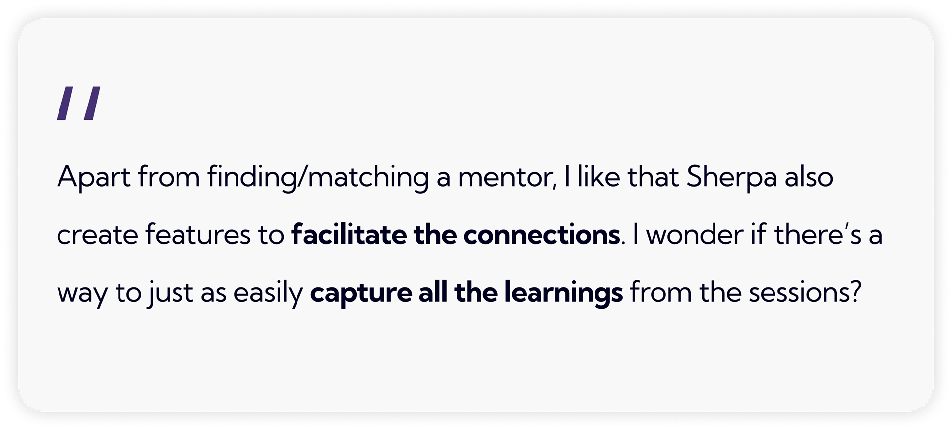
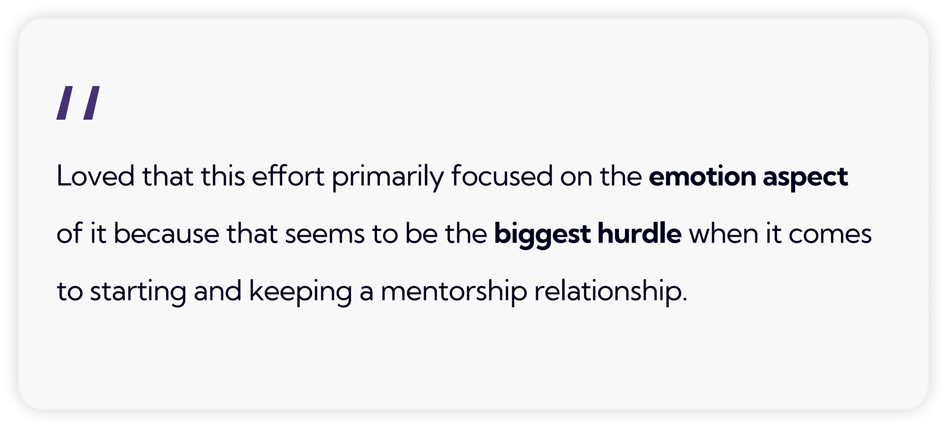
My team and I presented our research findings and design thinking in our final prototype to panel of design industry judges and peers. There, we received insights on areas we succeeded and questions we could reflect on, as well as being rewarded "Best UX Storytelling" amongst four other presentations.

Final Takeaways
Adapting for UI/UX
Coming from a background in graphic design, breaking into UI/UX design was a huge learning curve for me. Concepts like user research and usability testing were completely foreign to me, so it was a challenge grasping them and immediately applying my learnings.
However, working with my peers helped accelerate my understanding of designing for user needs. This was also an important learning experience of how to effectively communicate my design decisions, while also learning to compromise my opinions and being flexible as a teammate.
Reflecting on Sherpa
Based on the feedback from user testers and judges, I think we succeeded in creating a unified brand focused on removing anxiety-induced barriers behind mentorships.
That being said, I wish I could've learned more about what our target demographic had to say about our final prototype. There were also times where our team felt overwhelmed by the scale of our project given our time constraints, so I wonder how unique and competitive Sherpa would be amongst other mentorship platforms if we instead focused on one or two features.
Despite all the challenges we faced, I'm proud of what my team and I accomplished in such a short time frame. Projects like these keep me motivated in improving myself where one day I can create meaningful social impacts on my community.
