Background
I took part in a six-week sprint to a create a brand identity for an insect-themed food product. As a solo project, I created the logo, design guidelines, and packaging dieline through constant and frequent feedback sessions.
Introduction
Hoppers is an engaging brand of granola bars that celebrates its primary ingredient: grasshoppers. Using naturally responsibly harvested grasshoppers, these protein bars are environmentally friendly while providing a crunchy source of protein! Hoppers are for anyone interested in fitness, or those looking for a quick convenient snack.
Project Team Tools Time
Brand Identity Andre Lam Illustrator Six weeks
Packaging Design Photoshop Aug - Sept 2022
InDesign
Pen and paper
Project Objectives
■ Neutralize the stigma of eating insects by creating a lively and illustrative visual identity
■ Create a unique packaging that embraces the brand’s personality
■ Introduce bug protein as an environment-friendly option
Research
Moodboard
In Mexico, grasshoppers (known locally as chapulines) served as a popular snack since the 16th century. To honor this tradition, I wanted to incorporate visual features of Mexican culture, such as vibrant colors, floral patterns, and ornate lettering.
Logo Sketching
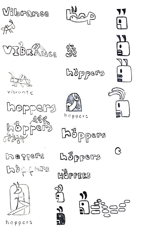
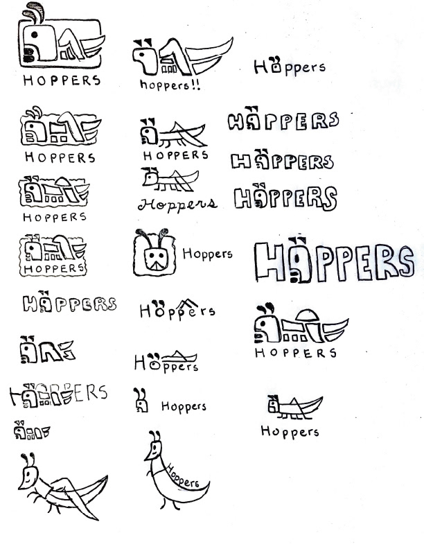
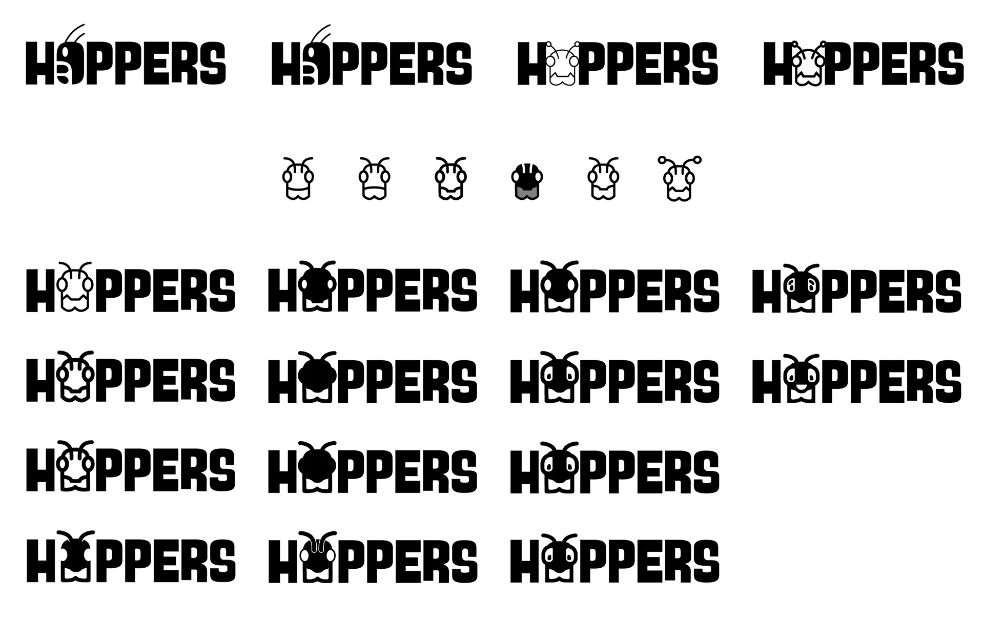
With my moodboard in mind, I sketched a variety of potential candidates for the logo. I moved on to creating digital drafts as I continued to tweak them.
Logo Refinement
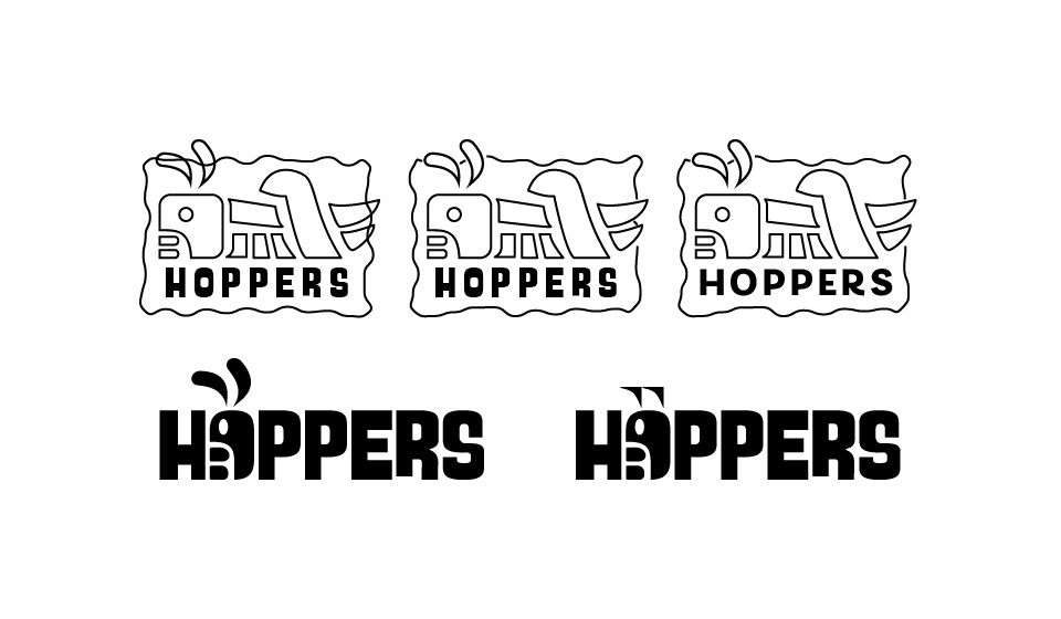
Once I settled on one design, I learned that users had difficulty recognizing the logo as a grasshopper. I went back to sketching and pivoted my logo to add more identifiable grasshopper features.
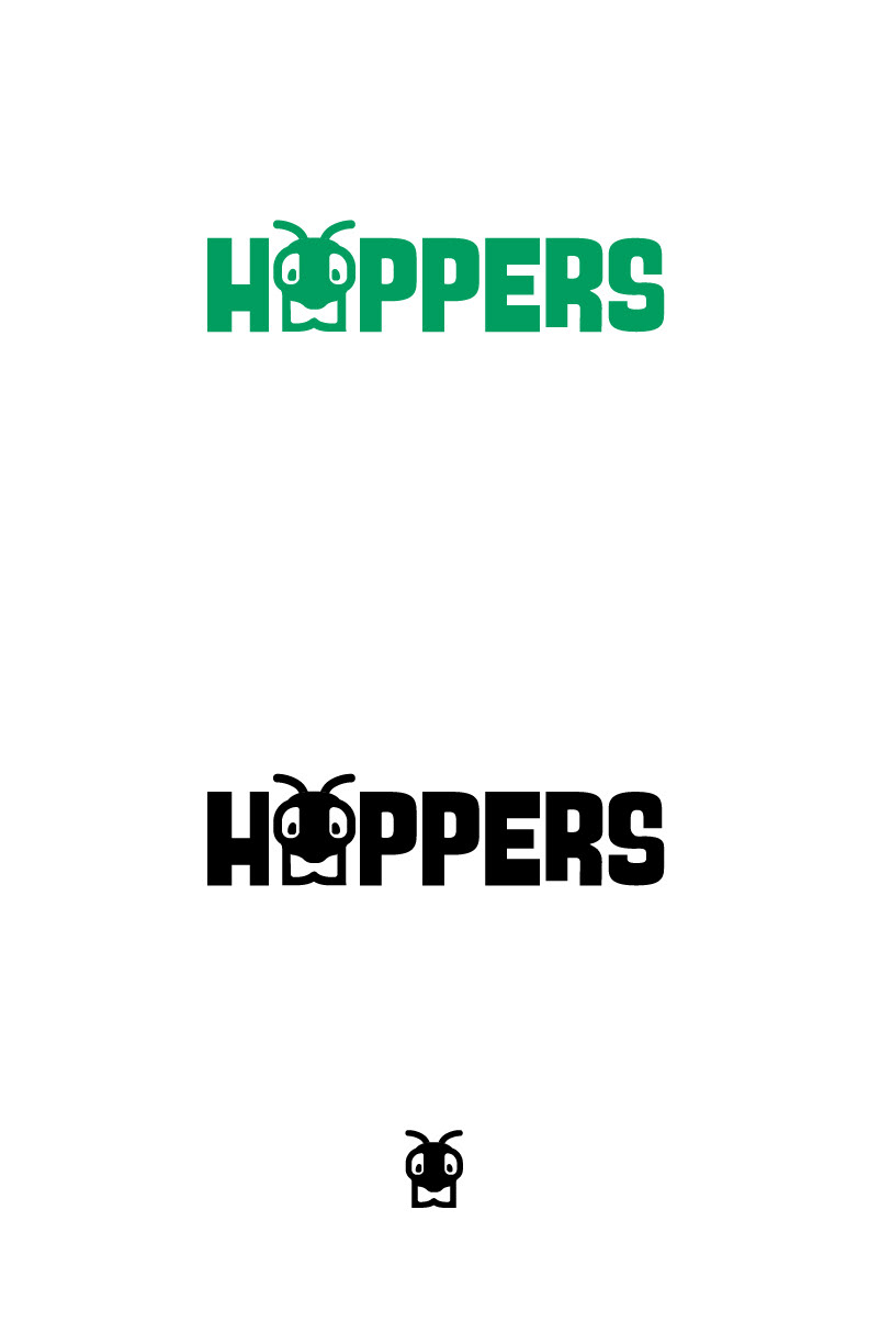
Final Product
Ultimately, I emphasized on two key words: health and friendliness, to help offset the shock of an unfamiliar ingredient. With this in mind, I designed the logo to be a mascot people can establish familiarity with.
Style Guide
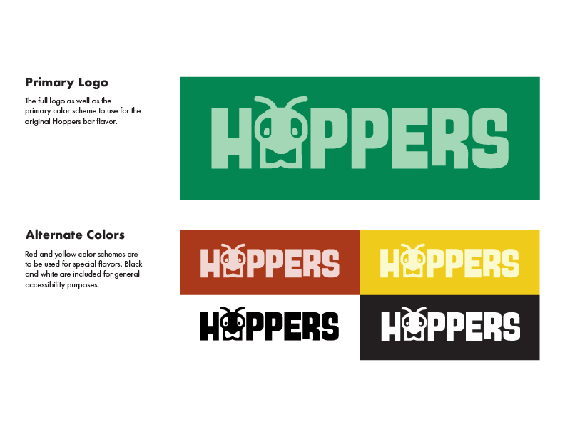
Primary Logo
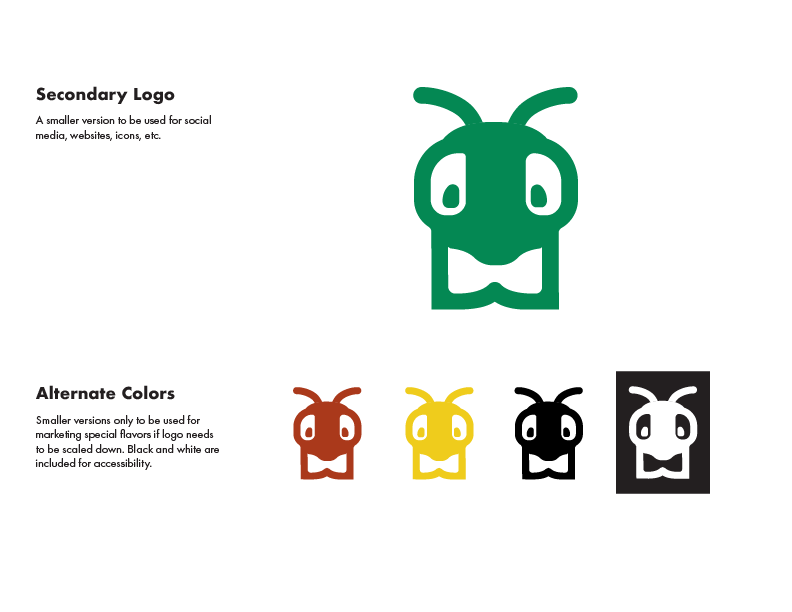
Alternate Logo
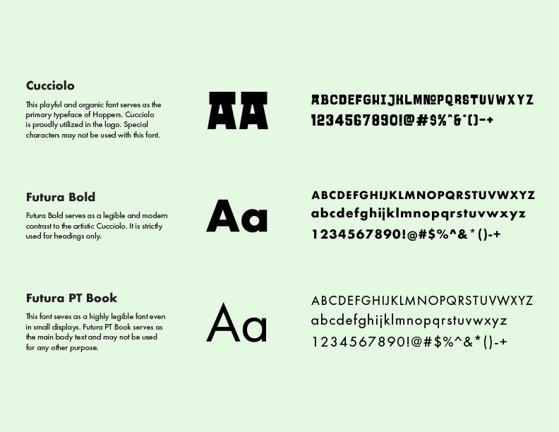
Typography
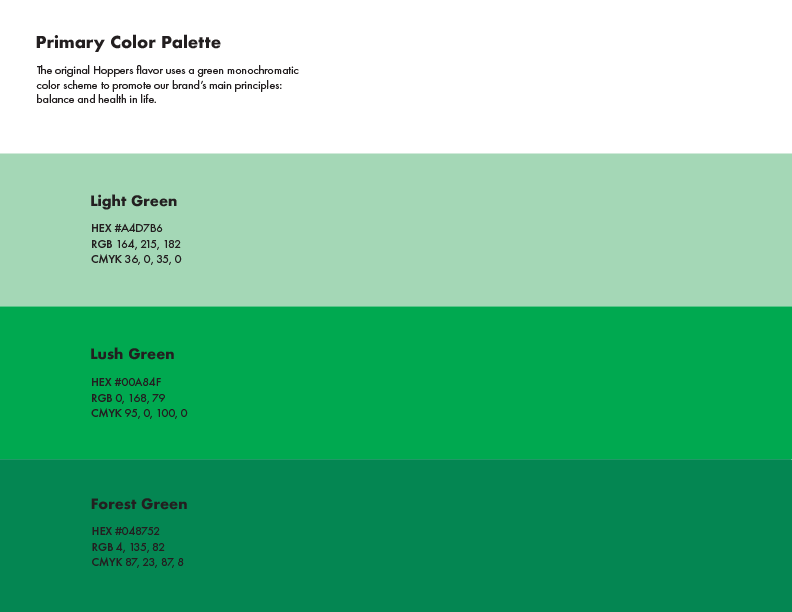
Color Palette
Dielines
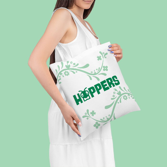
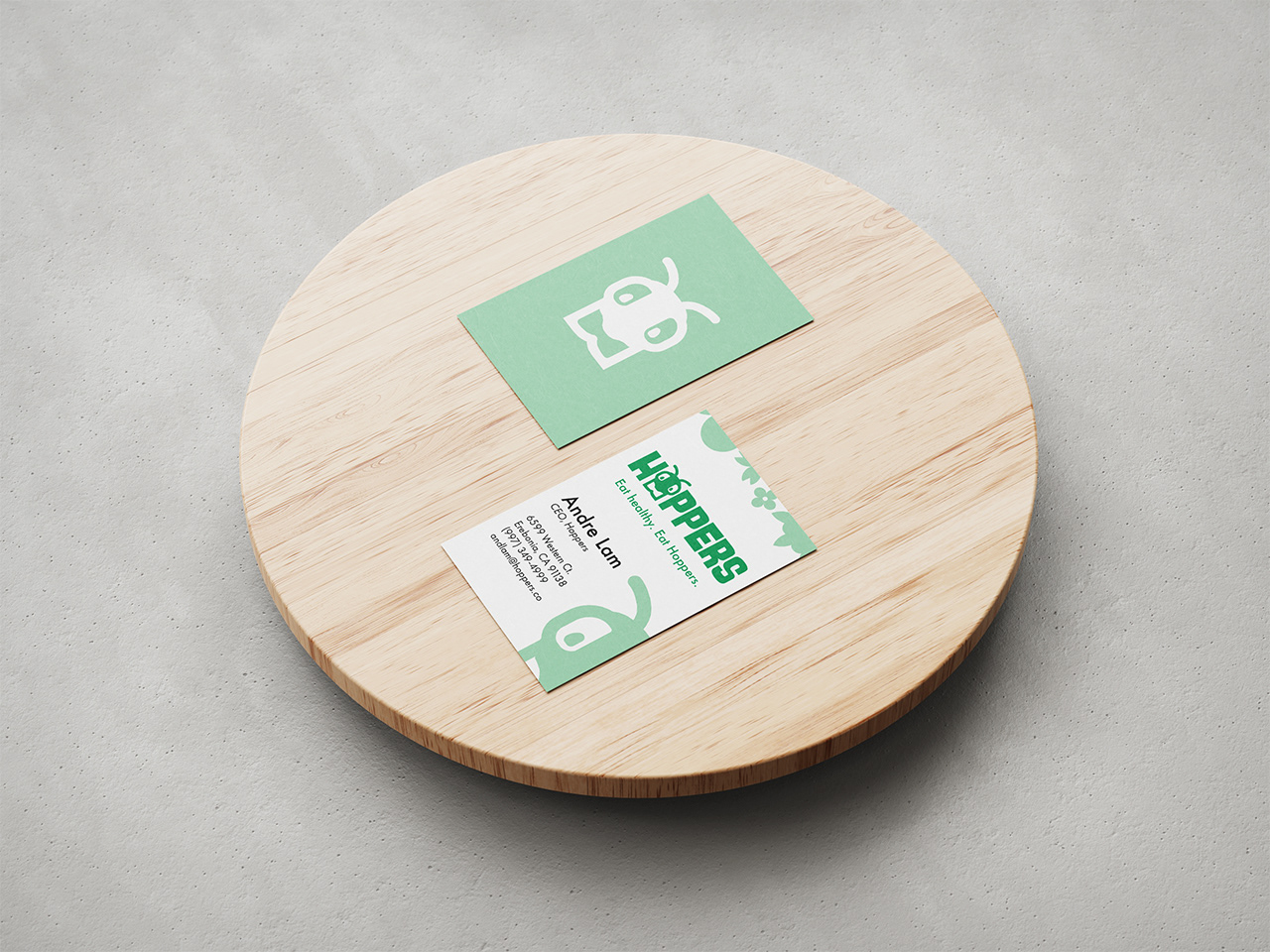
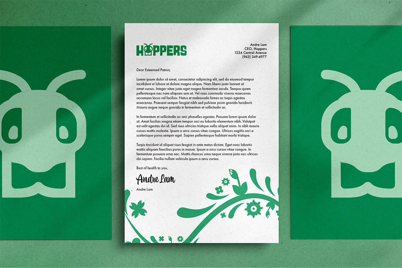
Marketing
The packaging uses biomimicry of a grasshopper's face to fully embrace its identity as an insect-based product. Similar to tea dispenser bags, the bottom portion of the packaging can be peeled away for convenient access to the granola bars.
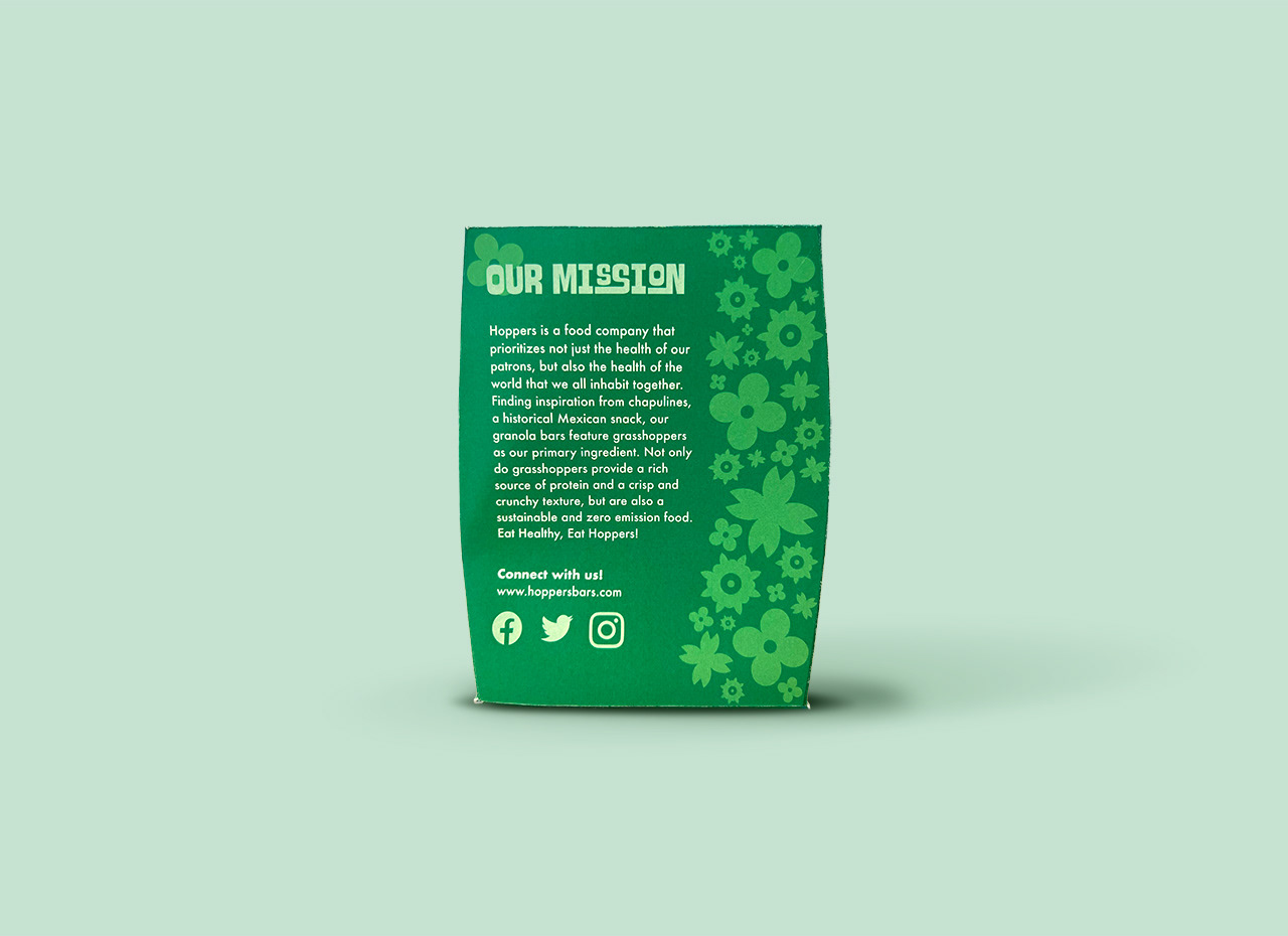
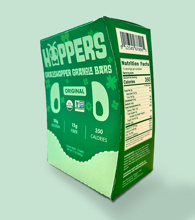
Takeaways and Reflections
Creating a Brand for the First Time
Learning about and creating a brand in six weeks was difficult, especially trying to maintaining polish in my work before having to move on to the stage in development. The logo was the part I struggled in most, which went through several different iterations before finally settling on a design.
Show, Don’t Tell
Visual elements such as imagery and color are far more effective tools for creating a compelling brand. Choosing the appropriate visual elements and putting them together effectively will be a challenge I’ll need to invest more time in.
Keeping Documentation
I often find myself learning about new ideas and techniques for every project, but tend to forget these tips after I finish a project. By taking notes during the process, it helps me grow as a designer to retain these lessons and avoid mistakes I've made in the past.
